Brand guidelines · v1.0
We build it. We run it. You own it.
Nextrum builds web platforms, business systems and products with Arabic and English interfaces. The identity starts with a clear direction: a chevron moving forward, followed by two arms that carry the work. This guide covers the mark, the wordmark and the ways we speak about the studio.
The idea
The name joins next and spectrum: the next step, and the range of work between a first sketch and a running product. The x is where those two meet, so the x carries the brand.
One mark, one move
A single chevron points forward. Two arms close in behind it. Nothing in the system should be more complicated than that.
The accent is the direction
The signal colour appears once per composition: the chevron, the key word or the primary action. Everything else is black and concrete.
Build, run, hand over
The thin gap between chevron and arms keeps the direction clear. It reflects the studio's work: make the decision visible, carry it through and leave the knowledge with the team.
Logo
Two parts that always agree: the symbol and the lowercase wordmark. The x in the wordmark is the symbol, drawn to the letters' x-height. Use the wordmark by default and the symbol where space is tight or the name is already present.
Construction
Two diagonal bands cross at 47°. The chevron is the left half cut at the crossing point; the arms are the right half, trimmed 26 units from the chevron edge. All values are in the symbol's own 688 × 525 grid.
Clear space
Keep a margin of T, the width of one chevron arm, on every side. Nothing enters it: no type, edges or imagery.
Minimum size
Wordmark: 96 px wide on screen, 22 mm in print. Symbol: 16 px, or 5 mm. Below those sizes switch to the symbol.
App icon
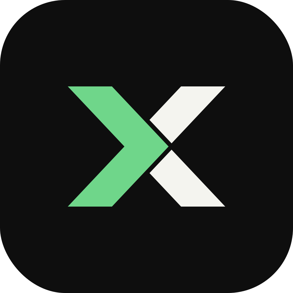
The reversed symbol on black, centred at 41% of the tile height. Corner radius is 22% of the width. The square version has no radius, for platforms that round it themselves.
Misuse
Colour
A cool concrete, a true black and one signal colour, green by default. Concrete does most of the work; the signal is rationed so that it still means something when it appears. Choose another signal with the colour button in the header.
Surface. The page and paper colour.
#DCDCD6 · 60%Type, primary buttons, reversed fields.
#0E0E0E · 25%The chevron and one key thing per screen.
#3FAE5A · 10%The signal tuned for black and night.
#6FD68A · 4%Dark theme surface.
#101110 · 1%Approximate share of any composition
Contrast
| Pair | Ratio | WCAG | Use for | |
|---|---|---|---|---|
| Aa | Black on concrete | 14.0:1 | AAA | Body, headings |
| Aa | Concrete on black | 14.0:1 | AAA | Reversed text |
| Aa | Black on signal | 6.8:1 | AA | Buttons, labels |
| Aa | Signal on concrete | 2.1:1 | Graphics only | Graphics, large display only |
| Aa | Signal on dark on night | 10.5:1 | AAA | Accent text, graphics |
| Aa | Soft ink on concrete | 7.0:1 | AAA | Secondary text |
| Aa | Muted ink on concrete | 4.7:1 | AA | Captions, small text |
Signal colours often fall below 4.5:1 on concrete. Use them for shapes and large display type, never for running text. The table updates with the selected signal.
Typography
Bricolage Grotesque for the voice, Instrument Sans for reading, JetBrains Mono for labels and code. All three are open source and load from Google Fonts.
Bricolage Grotesque
Headings and the wordmark. 600 for headlines, 700 for the logo. Tracking −3.5%.
Instrument Sans
Body copy and interface. 400 for text, 500 for emphasis. 1.6 line height.
JetBrains Mono
Labels, figures, code. 400 in caps with +8% tracking, set small.
Display · 72 / 0.95 · 600Software built around your businessHeading 1 · 48 / 1.05 · 600We build it. We run it. You own it.Heading 2 · 32 / 1.1 · 600The code is yours. So is the knowledge to keep it running.Heading 3 · 22 / 1.2 · 600A team that stays with the systemBody · 17 / 1.6 · 400We take on a small number of projects at a time so that the people who scope the work are the people who build it.Label · 12 / 1.4 · caps +8%Now booking · Q1 2027Graphic elements
Two devices, both derived from the symbol. Use one per layout. Product screens and the 3D line field on the site are imagery, not brand elements.
The cut
A single diagonal at 47° dividing two fields, with a gap the width of the symbol's gap. For section dividers and panels.
The crop
The symbol enlarged and cropped by the frame, one colour per half. For covers, social banners and empty states.
Voice
Plain, specific and calm. Write what the studio builds, what the client gets and how the work continues after launch.
Say what it is
Be specific
Stay calm
Tagline: We build it. We run it. You own it. Descriptor: Software engineering studio. Sentence case everywhere, no exclamation marks.
Arabic and RTL
The Arabic edition is written in Arabic, not translated from the English page. It shares the identity and changes the things that have to change: the voice, the type, the labels and the direction of travel.
Name
The wordmark stays Latin, set left to right, in every language. In running Arabic text the name is written نكستروم.
Typefaces
Kufam 700 for headlines and figures: a geometric Kufi with flat terminals that sits with the 47° chevron. IBM Plex Sans Arabic 400 and 500 for reading and labels. Both open source, both on Google Fonts. No tracking, ever.
Numerals
Western digits (0–9) in every context. They match the Latin wordmark, code and the figures users see in the products we build.
Display · 96 / 1.22 · Kufam 700برمجيات تبدأ من فهم عملكHeading · 56 / 1.3 · Kufam 700نبنيها، ونشغّلها، وهي لكBody · 18 / 1.85 · Plex Arabic 400المهندسون الذين يخططون لمشروعك هم من يبنونه ويدعمونه ويتابعون تشغيله مع فريقك بعد الإطلاق.Label · 15 · Plex Arabic 500نستقبل مشاريع جديدة · الربع الأول 2027Labels
Arabic has no capitals and no mono face, so the caps label is replaced by sentence case in medium weight, a little larger than the Latin label, led by the same chevron.
Full stops
Arabic display lines (headlines, the tagline, large quotes) never end with a full stop. Running text keeps it. The comma and question mark stay in headlines.
Mirroring rule
Direction glyphs (bullets, arrows) point with the reading direction. The symbol and the wordmark are never flipped, only moved to the other side of the layout. The 3D line field is imagery and may be mirrored to open space beside the headline.
Voice
قل ما هو
كن محدداً
ابقَ هادئاً
الشعار: نبنيها، ونشغّلها، وهي لك. الوصف: استوديو هندسة برمجيات. نكتب العربية بصوتها الطبيعي، لا كترجمة حرفية. خطاب المفرد المخاطَب، وبلا علامات تعجب. السطور الكبيرة لا تنتهي بنقطة، أما النص الجاري فيحتفظ بها.
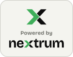
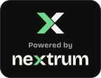
Powered by badge
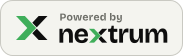
For client sites, apps and documents we have built. It carries the full wordmark, so the x travels with the name. Use the horizontal badge by default, the compact one in footers and the stacked one where the space is square.




Rules
Minimum width 140 px (horizontal) or 110 px (compact). Keep clear space of one badge corner radius on every side. Match the badge to the surface it sits on: light on light, dark on dark, signal on the accent colour or imagery. Do not recolour it, add effects, or re-set the text.
Embed
<a href="https://nextrum.dev" rel="noopener">
  <img src="https://nextrum.dev/brand/badge-powered-by-dark.svg"
       alt="Powered by Nextrum" width="184" height="56">
</a>
Swap the file name for light or signal. The domain is a placeholder until the studio's address is live.
Applications
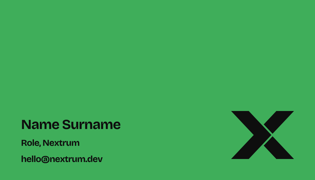
The system on the things a studio actually sends: cards, letters, signatures, links and tabs. Names and contact details are placeholders.
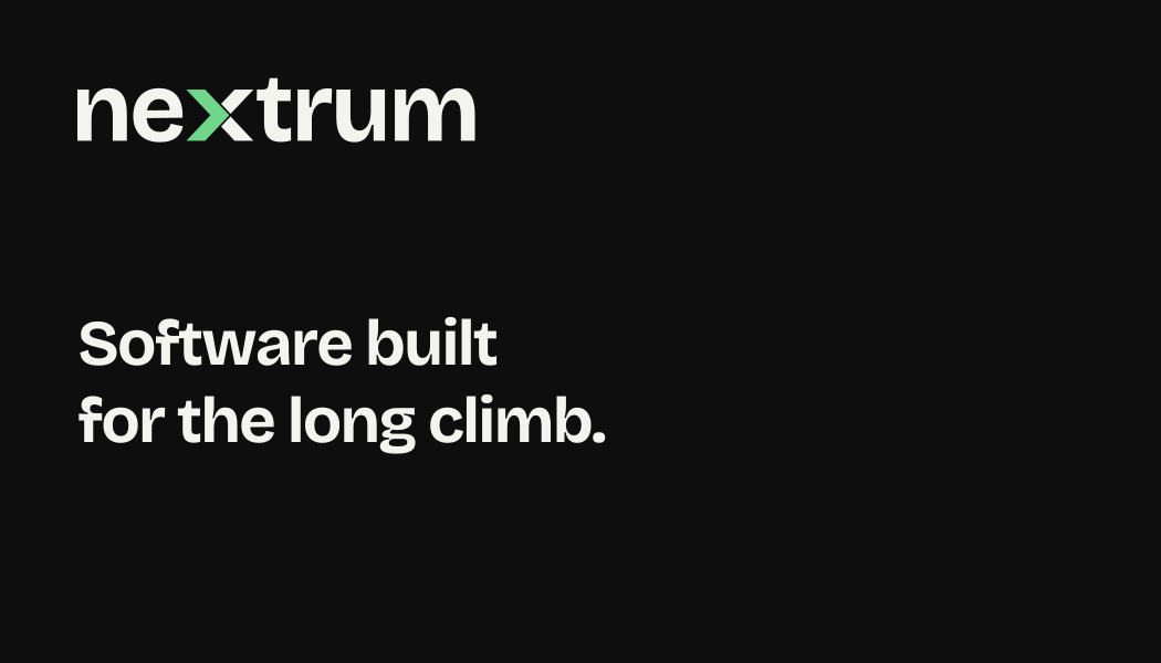
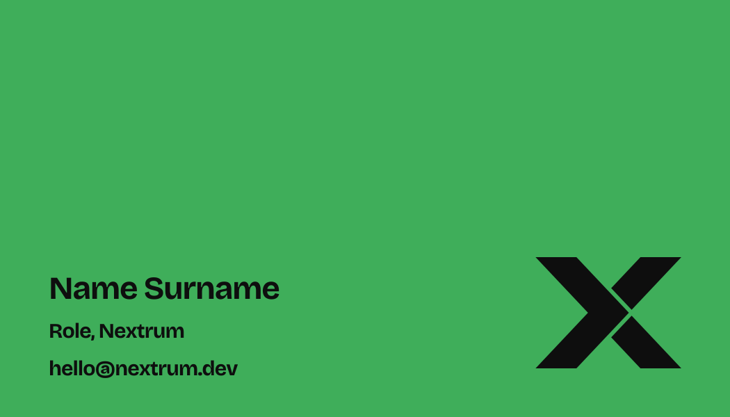 Business card · 85 × 55 mm · black and signal
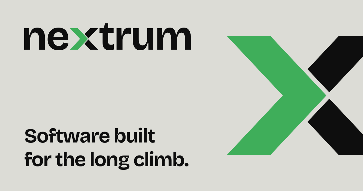
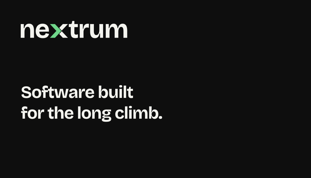
 Link preview · 1200 × 630Nextrum — Software engineering studio
Assets
All vectors are outlined, so they behave the same in any tool. SVG and PNG downloads use the signal colour currently selected in the header, except favicon.ico, which stays green.